7 - Versace
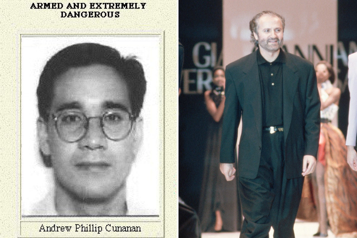
Having watched the Gianni Versace documentary I knew I wanted my icon to be very tragic, like his story. Gianni Versace was shot twice in the back of his head on the gate of his Versace mansion located in Miami. To say his death was tragic is an understatement, the whole world was in mourning, and all fashion enthusiasts were struck hard for Gianni was really a genius of his time, and to face his death in such a tragic way infront of a place he considered to be safe shook everybody.
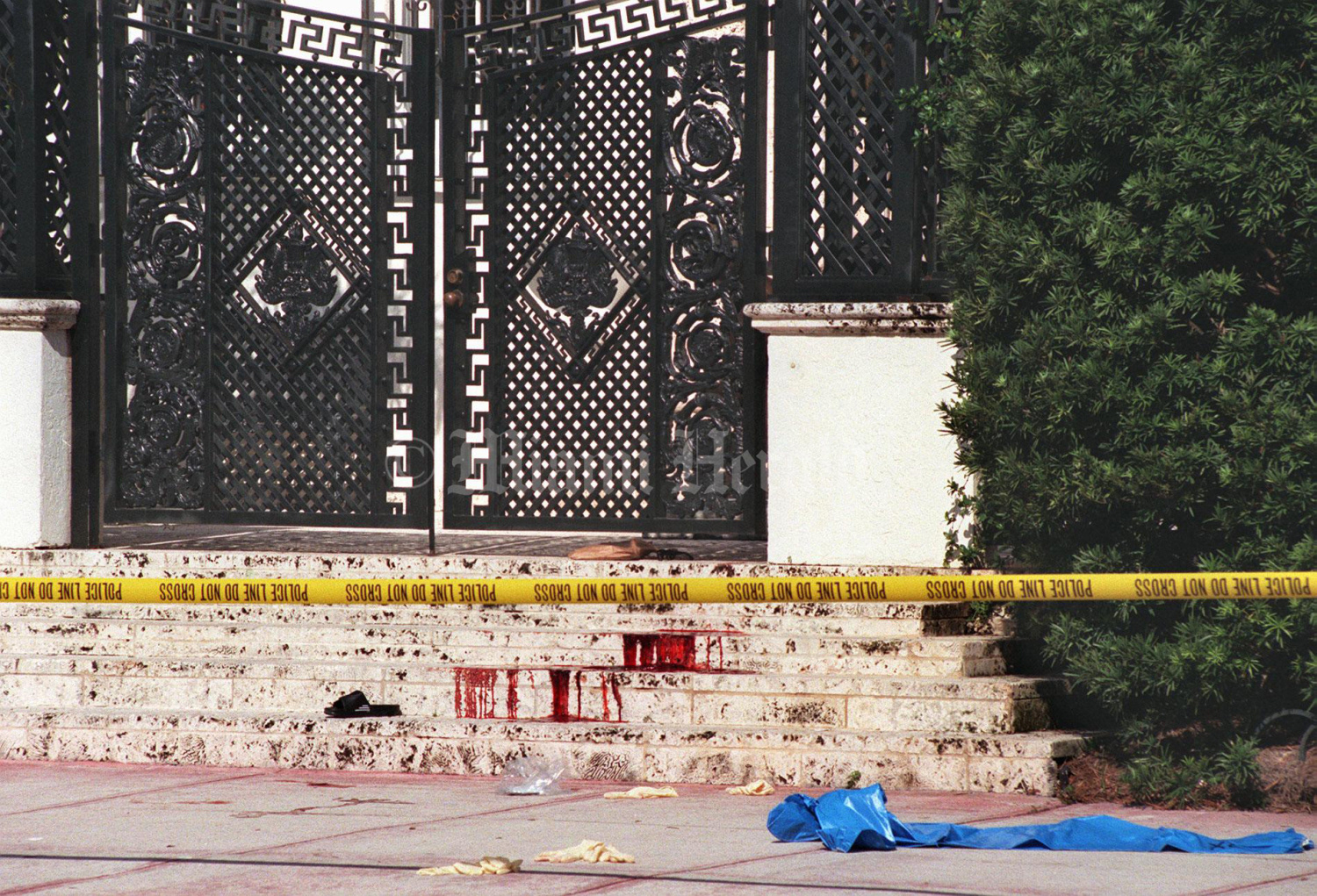
I wanted to paint a picture of the blood he spilled in front of his mansion so I started illustrating the famous medusa inspired Versace logo, incorporating blood like tones on her face, and these were some of the results:
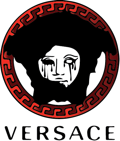
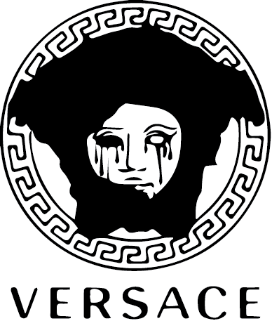
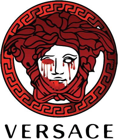
I ended up choosing the last for it really has an effective representation on the blood that was spilled on the mansion. In this illustration incorporating a strong color that represented the death and blood spilled was very important. Moving on to the sound I wanted two gunshots representing the two that killed him, and without saying it really drew the whole picture together.
8 - Dolce and Gabanna
Dolce and Gabanna is no longer the brand it used to be for it has become the face of tacky overdone designs, what really pushed them off the edge though was their very racist advertisement showcasing a Chinese woman eating pizza and spaghetti with chopsticks. Widely seen as offensive it led to a severe backlash in China with several retailers pulling the brand's products. The controversy escalated further when screenshots were circulated showing designer Stefano Gabbana allegedly insulting China in an Instagram chat. D&G insisted the account had been hacked and apologized publicly for the controversial ad campaign. Consumers in China called for a boycott on D&G. Here's why it was racist "She looks baffled and confused, an ingenue who has limited experience with pasta. She is so provincial that she uses her chopsticks to awkwardly twirl the noodles. What an imbecile, the viewer is supposed to think, having a good laugh at her expense."
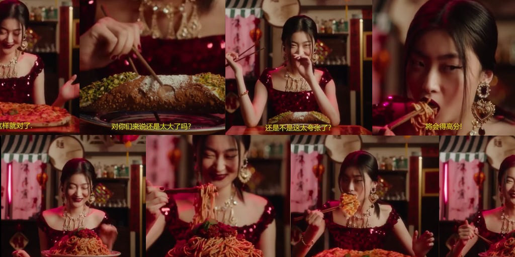
To be quite honest it was kind of hard to find a way to represent this in my icons, until I studied the stills of the ad, so then I realized I wanna showcase the absurdity of the chopsticks carrying the pizza since it is a culture clash and disrespect in a way. And for the color showcasing I went for red, a color Chinese people don't find respectful to be overused so it was a full circle I felt.
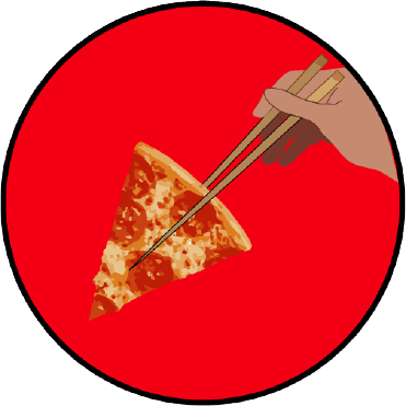
I am really proud of this one, I very much enjoyed the composition of the icon and it just felt very balanced and represented what I was going for perfectly. As for the sound, that was the difficult part to be quite honest, for chewing sound effects wouldn't have been as effective, so then I started searching into dolce and gabanna chinese and ads and found the perfect voiceover:
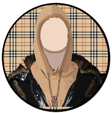
9 - Burberry
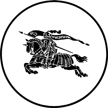
After that it was hard to find controversial brands, until I came across Burberry's noose mishap in one of their collections
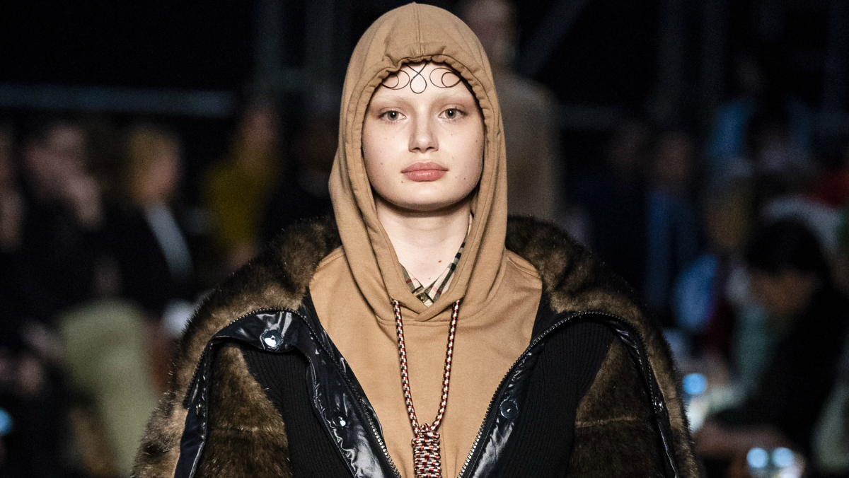
For this one I cant really go into detail, but I just re-illustrated the noose and hood, which again were very unsettling to look at and insensitive to both African Americans and people who'd attempted with committing suicide. For the sound I added a kind of triggering sound of a rope being pulled, just to send a message on what burberry didnt think of while making this collection
The icons:
http://127.0.0.1:50434/HTML_Layout_With_Sound/Icon_Template_square.html
Overall, it was a super interesting project, and I was really into it for it was a topic I was super passionate about, and I think any ethical fashion person would be too, and people into dark humor in general, So I think my audience really has to have a general idea of the fashion brands, or an interest in general.