Black Square class assignment
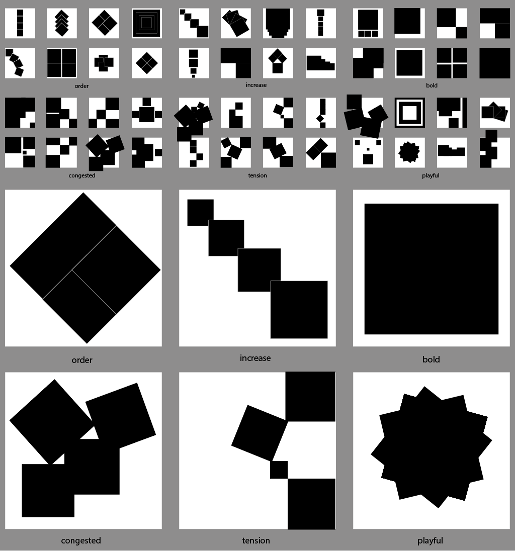
For this assignment we were exploring the elements of design, and were given a bunch of rules to abide by while creating these expressing these 6 words:
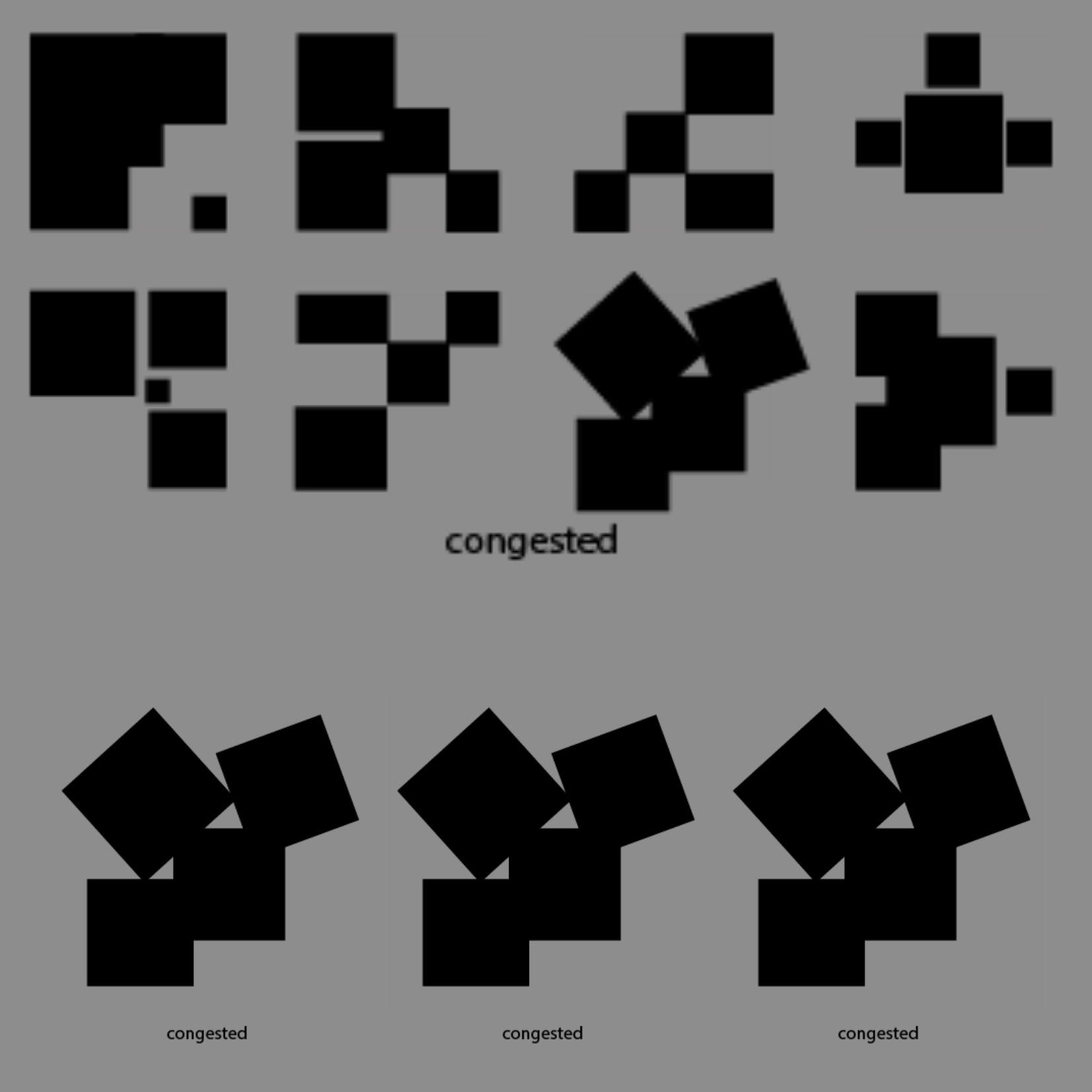
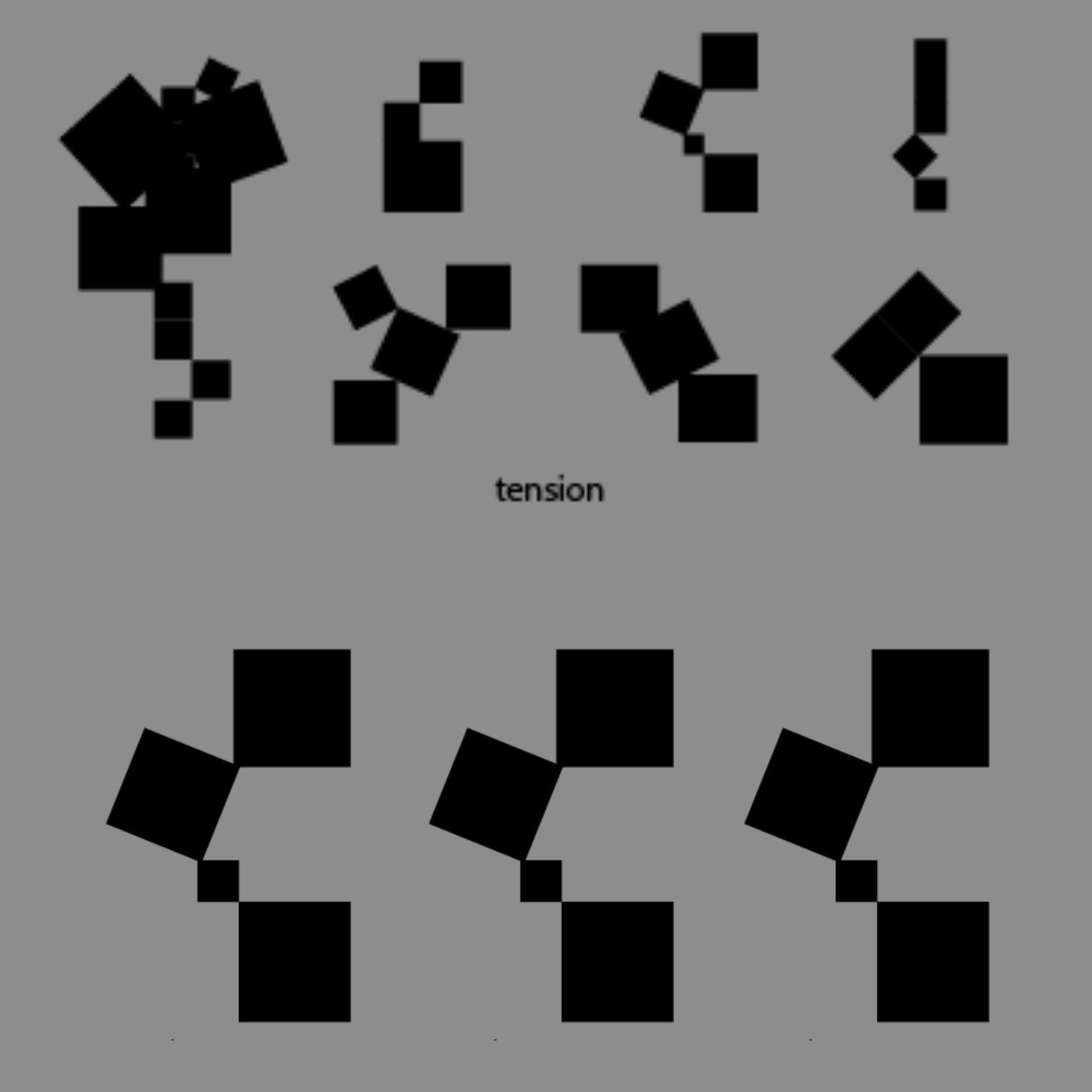
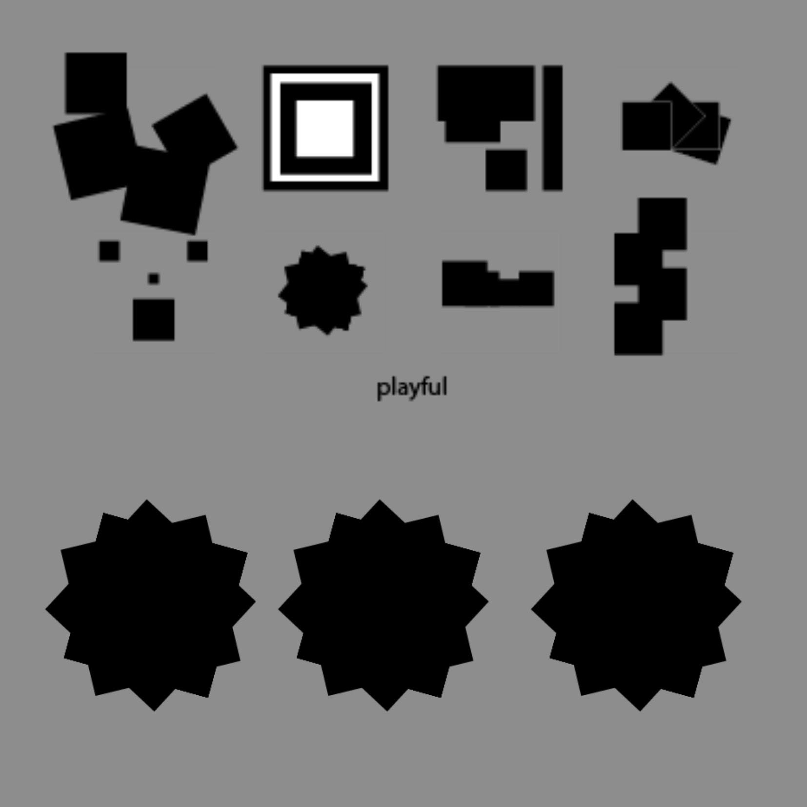
- Use only four black squares per white thumbnail
- You need to create eight emotional designs that reflect the intention
- Choose the best out of your emotional designs per intention and copy it into a large white square 6
During my first attempt at this assignment, I didn't read the rules to be quite honest, so I didn't quite follow the 4 so my first attempt results didn't really carry the meaning of the words well, or reflect the emotion or element of design we were supposed to portray, however after some iteration having seen everyone else's attempts, I took another try and here are my results:
ORDER
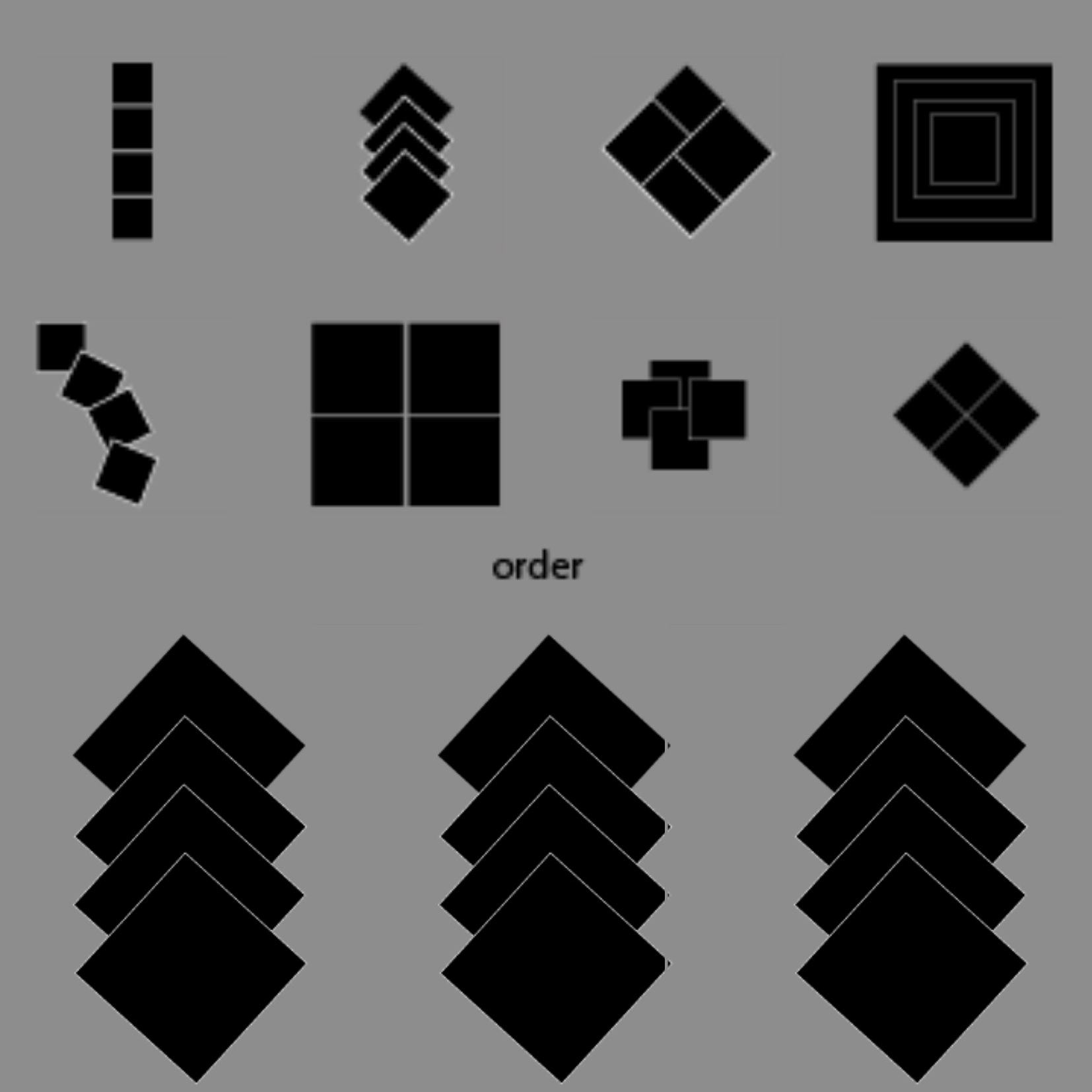
For order, I wanted to display how I view order in everyday objects in life, Mostly by perfected layering, or how perfectly some puzzle pieces fit together, as I showed in one of my order trials. However, I chose the layering iteration as my final, as remembering back in school order was portrayed in the mornings as we stood in a straight line after eachother.
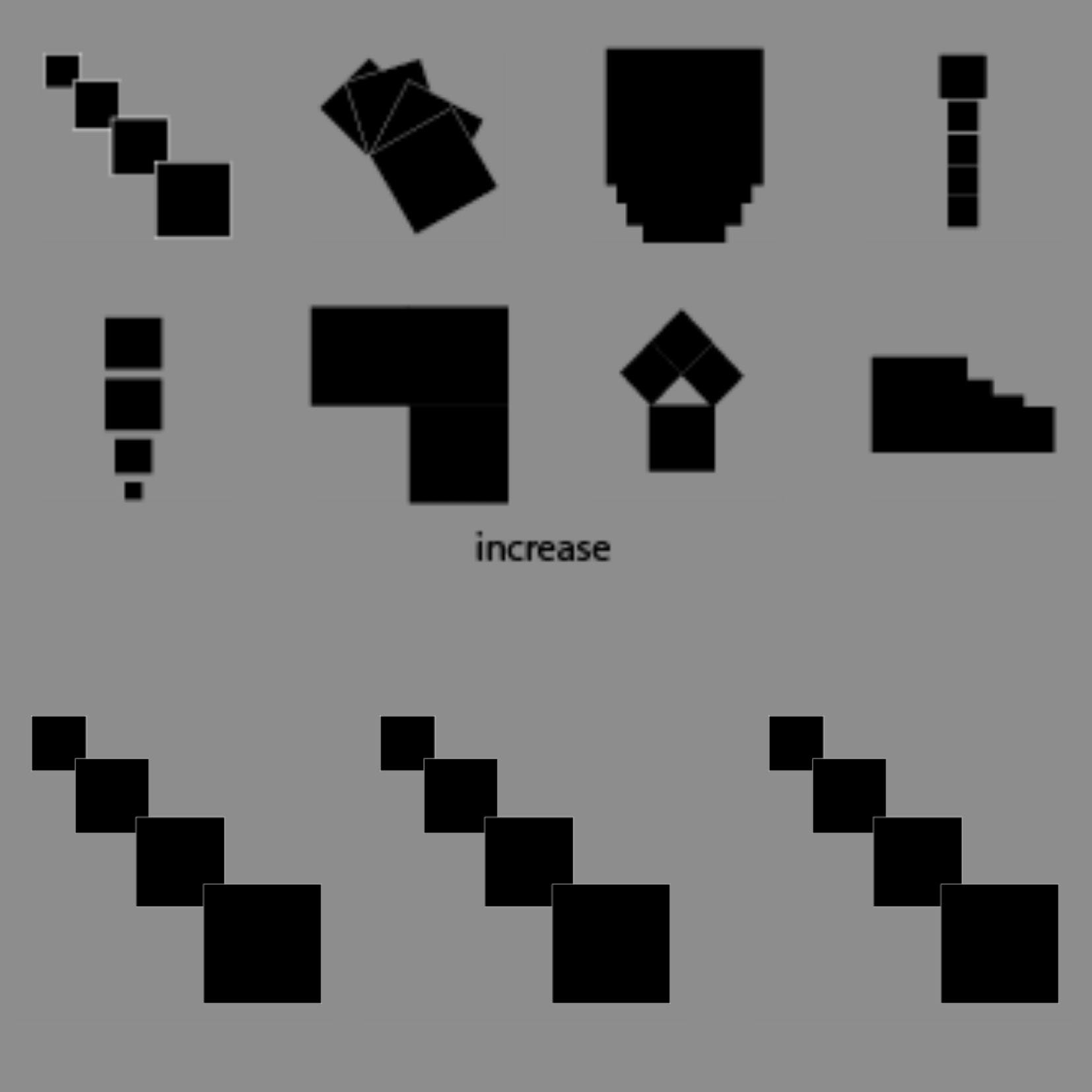
INCREASE
Color Theory
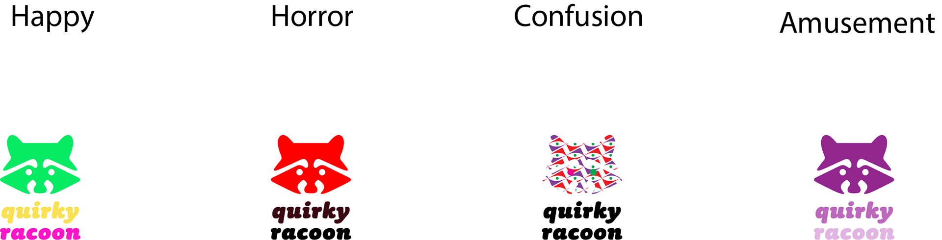
1 - Happy = I chose a combination of colors that whenever I see really pick my mood up, and overall remind me of my childhood, also overall split complimentary colors
2 - Obviously, red and black is a famous color contrast that always gives a horror feel, even in films widely seen together
3- For confusion it really doesn't get simpler than this, it makes absolutley no sense
4- For amusement, I chose different hues of the purple color since I feel like it represents how I see amusement, a monochromatic palette
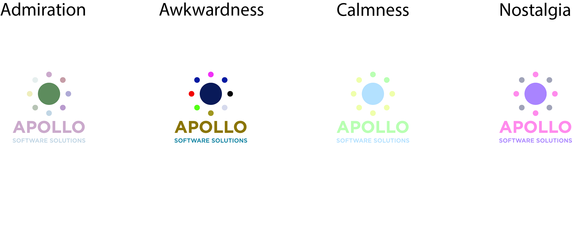
1 - Admiration, Lately neutrals and pastels in general have been really some of my go to colors, so I really admire them, and especially when they're all together, they're very complimentary and somehow monochromatic all at the same time.
2 - Very simple, very awkward to look at colors put together, it doesnt make sense therefore it makes the audience feel very confused and uncomfortable
3- I chose to go for an analogue colour palette, showcasing a pastel blue, yellowish-green for they truly make my eyes and mind relax
4- OBVIOUSLY, for nostalgia I went for analogue palette, purple and pink aka Barbie's famous go to colors, my entire childhood it was all about the pinks and purples solely because of barbie and many other doll manufacturers, so the combination really does make me feel nostalgic
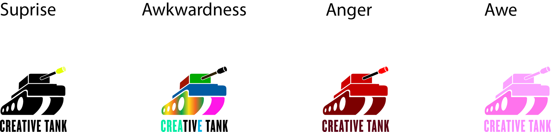
1 - Surprise, I wanted to make it very simple with a very strong color contrast between black and yellow representing a dark time with a surprise slowly developing
2 - Very simply put, very awkward, very not put together colors
3- Anger, I used a monochromatic build up of the color red, representing how I feel like my anger builds up, very neutral and the angrier I get the more red I feel
4- For awe, like I've mentioned before, pinks, put the color pink on anything and it'll make it look oh so pretty
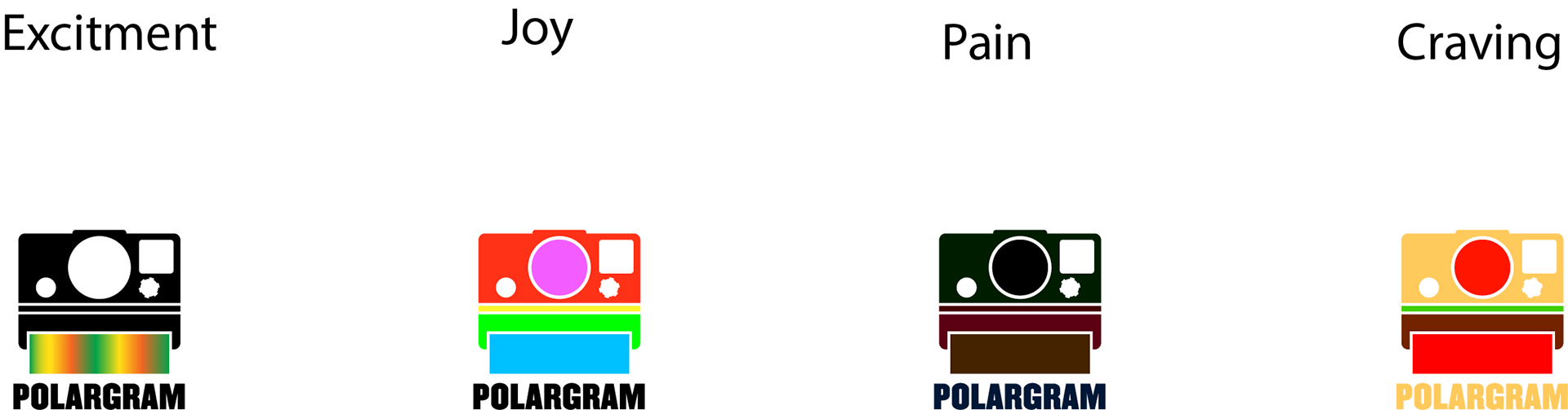
1 - Excitement, I wanted to represent how exciting a fresh new picture capturing a good moment is, almost as pretty as a rainbow.
2 - For joy, similar to happy I used colors we see on toys a lot, this time more unisex, for a new toy always made me feel joy or anything that represents childhood in general, and here I used complimentary colors
3- For pain it really made sense to use the very dark part of a hue of every color there is, for dull colors are usually worn to funerals, therefore making you feel pain and have you associate them with sadness
4- It's very clear, a burger, was it the best use of color? maybe not, do I regret it? No because this combination and layering of color will always make you think of a burger and make you crave it, easy
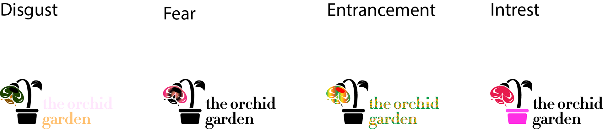
1 - Disgust, I tried to use colors that remind me of my vomit like brown and green, and the text colors remind me of raw meats which I really don't want to get into but utterly makes me feel want to gag
2 - For fear, I felt like the contrast between and pink represents fear super well
3- Entrancement, I liked the gradient for it truly made you feel hypnotized by the colors put against the black
4- For interest, I once again did the contrasted pink, red, and black, because I find it interesting to look at

- Boredom, brown is a very basic non emotional inducing color so a monochromatic set of browns felt right
- Adoration, once again another monochromatic set of reds/pinks because they always leave me in awe