1 - CHANEL
I wanted to start with Chanel since it was the mother to haute couture and Parisian high fashion, and it seemed like it had a pretty untainted reputation up until earlier this year when it came to light again that Coco was not really who we thought she was and that she had a dark history similar of that to Hugo Boss's and Volkswagen. According to multiple credible resources Coco Chanel was a Nazi spy.
"The availability of declassified French government documents has revealed her covert work for Nazi military intelligence during World War II. After the Nazis took over Paris in 1940, Chanel cozied up to Baron Hans Günther von Dincklage, an officer in Abwehr, the German military intelligence. Their romance enabled Chanel to move into comfortable living quarters at Paris' Hôtel Ritz, then doubling as a German headquarters, and kept her firmly entrenched in high society, which also had been infiltrated by German officers. Then there were her business interests: Since 1924, when the Jewish Wertheimer family had backed the launch of her perfume line in exchange for most of the profits, the fashion maven had sought to renegotiate things on more favorable terms. Now, with "Aryanization" laws forcing Jews to give up their businesses, Chanel saw the opportunity to reclaim a lucrative branch of her empire. Dincklage introduced his lover to another prominent Abwehr agent, Baron Louis de Vaufreland, who allegedly promised to help Chanel free her nephew in exchange for her service to Berlin. Sometime in 1941, Chanel was registered as Agent F-7124, with the code name of "Westminster," after her former flame. "
According to Hal Vaughn's book Sleeping with the Enemy, there is a record of her dinner with British diplomat Brian Wallace, during which she casually discussed life in occupied Paris and the animosity the French and Germans held toward each other.
According to Sleeping with the Enemy, Chanel also took care to erase evidence of her actions, where possible. Upon learning that an ailing Schellenberg was planning to publish his memoir, Chanel paid his medical bills and ensured his family was on sound financial footing; the subsequent memoir had no mention of her involvement as an agent.
Chanel reacted to these allegations by claiming they were false to which people compared to vaughan's credibility:
Hal Vaughan credibility: He has held several posts as a US Foreign Service officer before becoming a journalist on assignments in Europe, the Middle East, and Southeast Asia. He has also served in the United States Military in both World War II and Korea, and was involved in a number of covert intelligence activities as a U.S. Foreign Service Officer at Karachi and Geneva during the Cold War. His French-born wife, now deceased, worked with the U.S. intelligence community in Geneva. Vaughan has intimate knowledge of clandestine, international operations.”
There are reports about Coco’s ‘violent loathing of Jews‘. When the war began, Chanel was already in a romantic relationship with German aristocrat, Gunther von Dincklage, who “reported directly to Nazi propaganda minister Joseph Goebbels, right hand of Hitler".
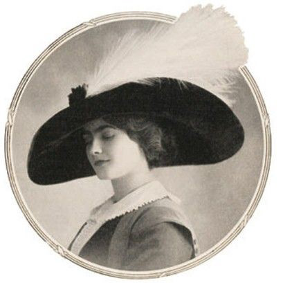
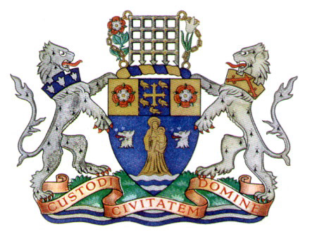
Based on the research and her big "Top Hat" operation with the code name Westminster, I started looking into inspiration within these pictures for my icons. I really enjoyed the form of duplication and duality of the two lions in the Westminster emblem, and immediately though of Coco's own duality and her two characters mismatched. The socialite Parisian fashion designer, and the double agent who "did what she had to do". I then looked into why they'd called the operation top hat, and through more research I found that most of Coco's photographs she's wearing very extravagant hats, and that she entered the design scene by making and selling these hats, so I really wanted it to be evident in my icons as well for it seemed like it was a part of her everyday uniform.
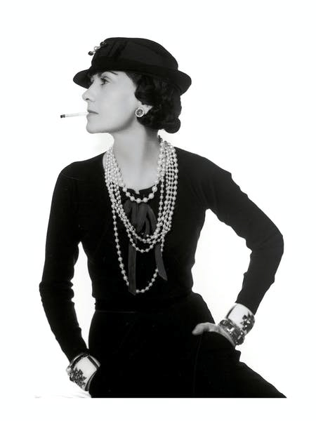
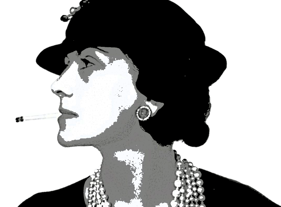
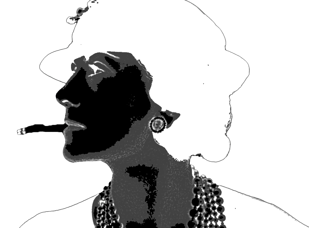
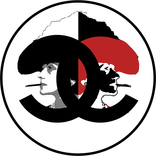
To develop my final outcome, I looked up pictures of Coco until I found this silhouette like one of her smoking a cigarette, a French must, and wearing one of her very own hats. I had this lyric stuck in my head from a Frank Ocean song that goes like "I see both sides like Chanel" and it was the entire inspiration behind the design. I wanted to do just that, show the two sides of Chanel representing her traitorous and socialite personas. I wanted to use the principle of design, balance, to create the duality of the characters. I then wanted to represent the dark side using color, so I inverted the same picture making her face mostly dark, and facing the opposite direction. After having done that I still felt like there was something missing. And that's when I did more research and decided to color the dark Chanel's hat the Nazi red color to make the message stronger. Finally, I was able to fit both characters into the opposite sides of the Chanel logo, pulling it all together. Honestly, I am super proud of this having it been the first icon I just worked on for it carries on the character duality, and the dark side super well. As for the sound I went for the "both sides like Chanel" lyric from Frank Ocean's song (Chanel), for it was the true inspiration behind it all, and I feel really brought the whole story together.
2 - Fendi
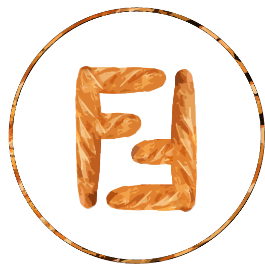
Fendi's icon was maybe the smoothest one I worked with, for I wanted it to be light and funny humoring the brand for it's truly one of my favorites, and I personally felt even through the research there wasn't much to say negatively about the brand. So the first thing tat came to mind was their iconic baguette bag that's been sought after for the past 3 years after it's been reintroduced back to fashion, so I wanted the joke to be on the spot and a bit tacky, since it's been done millions of times before. So I created a pattern on photoshop of a baguette crust, editing it enough to appear flat and this was the result:
As for the sound I just chose to go with a very simple crunch noise, I made on my own smashing potato chips.
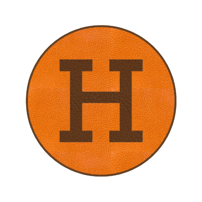
3 - Hermes
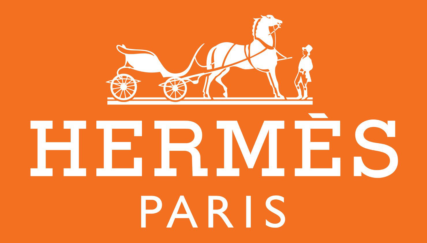
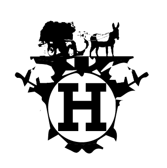
For this icon I really had fun, Hermes alongside Fendi I wanted to just genuinely make fun, for it is maybe one of the most exclusive high fashion houses, carrying one of the most sought out bags in the market, the birkin, making Hermes a very valuable company. SO after some research I found out that Hermes was built around equestrian fashion, in other words horse riding clothing, and I noticed that they had horse carriages in most their logos:
So for my first ever draft being Egyptian and all I wanted to change one aspect of the branding which is the horse, into a donkey, in a mocking way of the brand. Since donkeys are usually animals that represent minority while Hermes represents the 1%, so I rebranded the logo by illustrating a donkey and a carriage.
However I did not really like it or feel that it was effective or carried my message, or even carried my message that well so I went through some iterations with the flipped and pre flipped images.
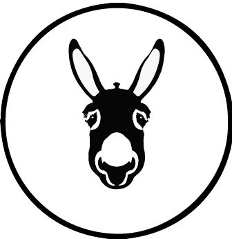
After all these iterations, I really enjoyed the icon on the right for it would've represented what the brand is about super well what with the leather pattern overlaid, and the branding colors of the brand
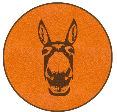
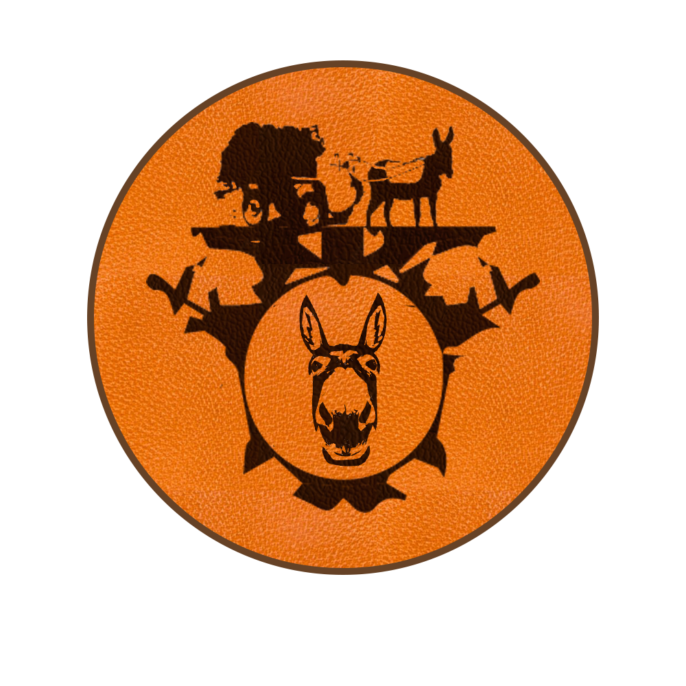
So for my final flipped image I was stuck between these two, and then I felt like the one on the left was super clean and just got to the point. I also found that applying the leather pattern overlay and Hermes brand colors juxtaposed the donkey's silhouette, in a way showing Hermes' way of luxurifying anything on its way. And for the sound I added a donkey neighing noise. I wouldn't say my strongest one, but definitely made a point and anyone with fashion background would get the reference almost immediately.